
I think the depiction of Hobbits is an interesting thing to observe throughout the life of this game. I originally planned this article to be released around the time the art style of the game in general was being discussed. At that time there were somewhat polarizing opinions, some thought the style was too cartoonish, others were completely happy with the direction. Whatever the case may be, these more recent AP’s have taken the middle ground. That being said, I still wish to go over these hole-dwelling folk but before I delve into the Hobbits throughout the past few years I wanted to find out how Tolkien described them.
“They are (or were) a little people, about half our height, and smaller than the bearded Dwarves. Hobbits have no beards. There is little or no magic about them, except the ordinary everyday sort which helps them to disappear quietly and quickly… They dressed in bright colours, being notably fond of yellow and green… Their faces were as a rule good-natured rather than beautiful, broad, bright-eyed, red-cheeked, with mouths apt to laughter, and to eating and drinking.”
A lot of what you just read you have seen almost across the board. In the novels they are often confused for children and their usually positive demeanor (which goes in line with their bright eyes and rosy cheeks) was sometimes met with frustration by the other types of folk in the story. Though there have been certain “sub-races” of Hobbits that have had subtle stubble, the clean-shaven look is mostly a constant through the years. Here are just a few depiction of Hobbits from various artists:

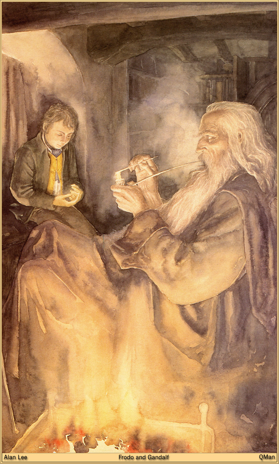
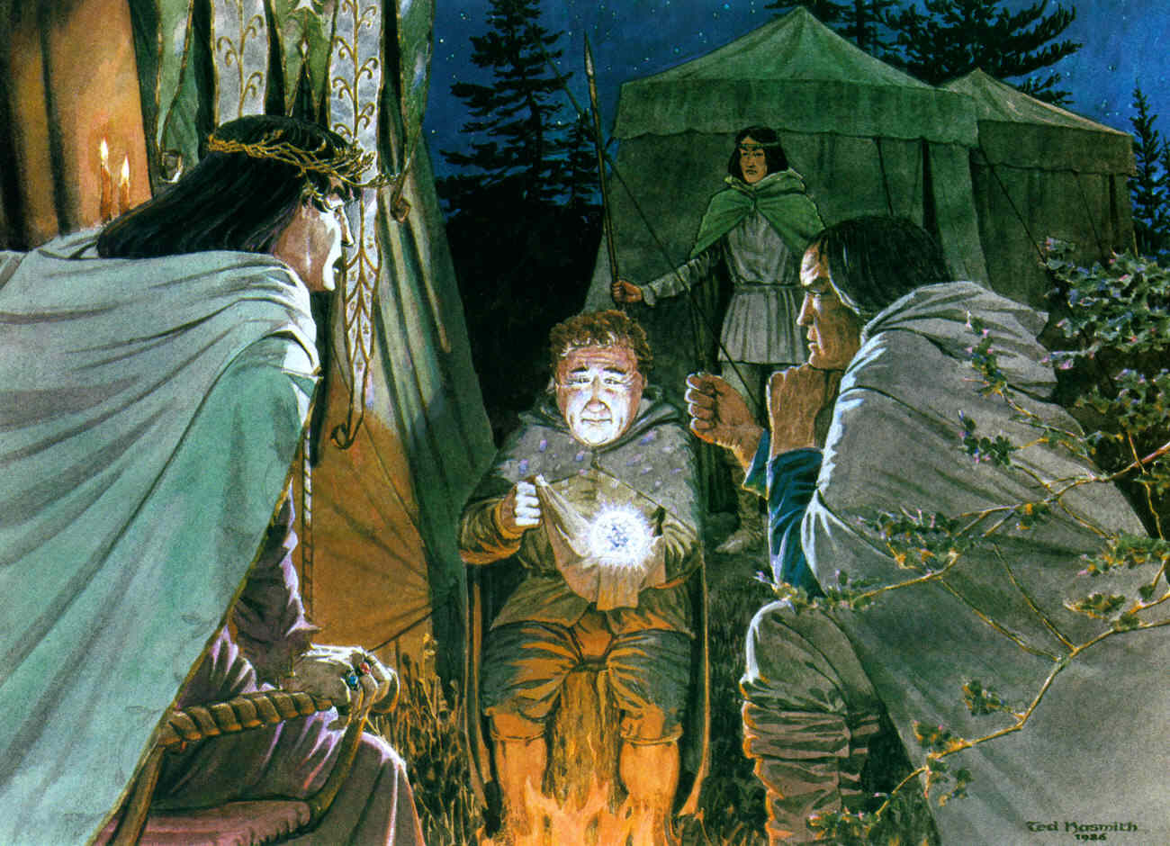
The above illustrations are from three of the most well known Tolkien artists (that I can think of at least). The first two belong to Alan Lee who illustrated (top to bottom) Bilbo and Frodo. The third image is from John Howe and depicts a very meek looking Bilbo (I assume). Lastly the fourth illustration is from Ted Nasmith and represents Bilbo’s offering of the Arkenstone in the Hobbit. All of these illustrations have their own major differences and yet mostly adhere to Tolkien’s depictions. Alan Lee’s depiction of Bilbo and Frodo doesn’t necessarily emphasize their merry faces but they are very clearly a little folk and they enjoy vibrant strokes of Green and Yellow on their clothing. John Howe’s depiction, on the other hand, really sends home the facial qualities of Hobbits. The Hobbit in the picture (again I assume is Bilbo) looks innocent, sweet, and good-natured. His round face is a little cartoonish but that fits with the nature of Hobbits I’d like to think. Of the illustrations, John Howe’s is my favorite. Then there’s Ted Nasmith’s depiction of Bilbo. This Bilbo looks considerably older, there are aging lines on his face and he looks more like a tiny old man then a child-like hobbit. Yet we can see the curly hair, the rosy cheeks, and wrinkles on a face that definitely looks “good-natured.”
Now let’s go to the first Hobbit we see in the card game:

When I began to write this article I was surprised at the lack of representation for Hobbits found in the Core Set. It could have been that giving the players too much in the beginning would have spoiled and saturated things in the long run but if the game never took off the ground and we were only left with a base box, this is the only Hobbit we’d get to see, illustrated for us by Tony Foti.
That isn’t to say the Wandering Took is a bad depiction. Though he looks a bit more mischeavous than good-natured (that knife doesn’t help his case) he still looks pretty carefree. Plus he’s a Took, which is worth noting, as they seem to be the Hobbit family that strays often from what is typical of Hobbits. And of course he’s spotting a green vest and golden yellow shorts.
Next up is the Hobbit that started it all (story wise):

Tony Foti gives us back to back Hobbits with his depiction of Bilbo. His approach to the resident of Bag End isn’t breaking the mold, and in doing just that very much fits the nature of Hobbits. Here we see Bilbo, reading (most likely) by candlelight. Though his Tookish side may be getting the better of him, with that sly grin, he seems all together peaceful and at ease with himself. Outside of that we can see a round face, curly hair, and golden yellow jacket.

Next up is a card seen in multiplayer as opposed to solo, Campfire Tales. This card, illustrated by Felicia Cano, doesn’t depict a particular character but rather three and is focused on a moment more so than characters. This event card portrays (as indicated in the flavor text) Strider telling the tale of Tinuviel to Frodo and Sam. In this depiction the Hobbits look very child like, not like the young adults we see in other depictions. I really like this piece of art and I was amazed as to how much detail is given to the Hobbits, even if Strider is the central character in this piece. Their large pointed ears, however accurate, seem a bit exaggerated and fairytale-like, but honestly are right at home in a card portraying a storytelling moment.

This is still one of my all time favorite pieces of art in the card pool to this day. I already have gone into detail on how much I like John Stanko‘s depiction of Frodo Baggins in my first art article here. Frodo’s face is a little more sharp looking and he doesn’t look as round and rosy as some of his kin but this I feel, is a tribute to his character, who is somewhat noble and is noted to have stood out among his fellow Hobbit. I’ve always seen this Frodo as the one who has already completed his journey. His face, and in particular his outfit, give him a tired and at peace air about him, like a patient in a hospital wing having recovered from a tragic event or major surgery. As far as visuals this particular depiction of Frodo caters more, I think, to the films than in the novels but I think it still does a fantastic job representing this Hero from The Shire. As I mentioned in my original article, I’m a little saddened that we don’t get to see more of Mr. Stanko’s work. A Hobbit can dream!

I can’t believe I’m going to say this but I don’t know if I like this piece by the amazing Magali Villenevue. She does stunning work, and her depictions of the people of Middle Earth are probably my favorite all around but strangely enough I think what I don’t care for in this piece are the clothes. Most Hobbits like golds and greens and the occasional red (typically if they have some money for the expensive fabrics). This particular Hobbit just looks a little too brown and grey for my taste. Maybe the whole card just looks gross to me. Second Breakfast is still a fair depiction of Hobbits and touches on their obsessive love for food, so there’s that.

Ah… the notorious and infamous KET. Despite the general opinion on the card itself I really enjoy the look of this Hobbit. It’s nothing too fancy (which is fine since it’s an unnamed Hobbit) but it meets most of the criteria and is just a nice piece of work all around. Vests seem to be another thing to add to the Hobbit check-list since almost all of them are sporting one. Anna Mohrbacher‘s representation of the Keen-Eyed Took is simple but true to the spirit of Hobbits and like many of the artists I’ve looked into since starting this blog I wish we could see more of her work.

I like this one. It’s definitely very cartoony, which sticks with the name of the card and the flavor text included at the bottom. Though I don’t feel this looks a lot like Bilbo it does a great portrayal of the moment in “The Hobbit” when our Hero is teasing the spiders of Mirkwood, taunting and distracting them. Here we see a very carefree Hobbit who may not exactly know the danger is in but still very much enjoying his little game. This is another key strength of the Hobbits (at least for Tooks) and I’m glad to see their trickster nature return a few adventure packs away from the Wandering Took further up. Carolina Eade, who illustrated Song of Mocking, had another piece of hers recently seen last cycle in the card O! Lorien and so I hope that’s a sign of more of her work coming later on down the road.

Then Hobbits kind of fall of the map for awhile and we don’t see them again until The Long Dark AP. This is probably because Dwarves were the chief focus. This time around we aren’t seeing a Hobbit Ally/or Hero but rather an Attachment that could have represented many moments in the novels. Love of Tales portrays one of the most pivotal moments in “The Lord of the Rings” and includes none other than Sam Gamgee. Here we see Sam, illustrated by Winona Nelson, spying on Frodo and Gandalf while they discuss very worldly matters. It’s at this point that Sam gets caught by Gandalf and begins a journey that would have turned out drastically different if not for Sam’s involvement. It looks like an illustration lifted right off of a “Young Adult” version of the books, with plenty of details (like Gandalf in the window) for fans of the story to notice. As for Ms. Nelson’s depiction of Sam I would like to imagine him looking a little more round and heavy set (as he’s often depicted) but this certainly looks just Hobbit enough.

Magali returns! (As she often does). This time, instead of a nameless Hobbit, we get to see Bilbo, albeit much older, lost in Peace, and Thought. According to the flavor text this is Bilbo as we see him in the Hall of Fire in Rivendell, after he has been apart from the ring for seventeen years and his body suffering from actual aging.Perhaps this is Bilbo as he begins to feel the fatigue that had been held at bay from The One Ring. He does look a little Scrooge-ish with the hair but the rest of him, his feet, and the green vest, are true to form. I really enjoy this piece and I particularly like that Bilbo is sitting right up by the fire, legs crossed with a big ol’ book in front of him. It’s great to see moments like this captured in the game. With all of the questing, traveling, and fighting, taking a respite to soothe the pains that burden us is a major component to “The Lord of the Rings.”
Then it’s off to Gondor! We of course don’t see many Hobbits throughout the cycle as the focus is on the Men of Minis Tirith and the Outlands. Nevertheless, near the end of the cycle we are treated to one of the main Hobbits in the story, and as a Hero card!

Look! It’s Magali again. I think the art in this cycle may contain many of my favorite pieces, and that could be because how prevalent she was at this point. Seeing a Hobbit with their head resting on their hand while they sit on the side of a road, eyes wandering off, is probably about as Hobbit as you can get. Pippin’s very slight smile is a thematic win for the character and the piece itself is just wonderful to stare at. The colors, the lighting, everything is beautiful. Whatever Pippin is dreaming about, whether it’s far off places or where he’s going to get his next pint, you can tell he is lost in his own head. It is a shame that the card ability itself isn’t as much of a home run as the artwork.
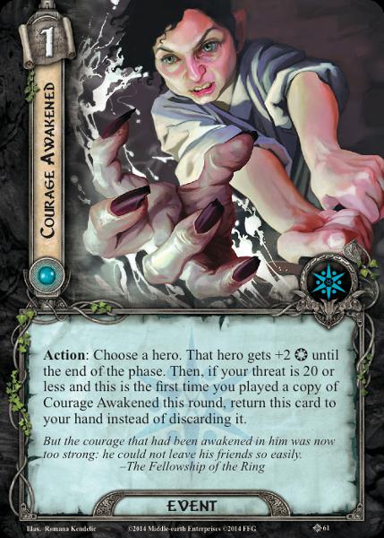
This next illustration of a Hobbit is where things start to look more like the Hobbits of today. In this piece we see Frodo, presumably, gaining the courage to fend off some fiendish foe. The flavor text indicates this could be the severed hand found in the barrow in which the Hobbits are trapped in the Barrow Downs. This is a slight deviation to the story but Romana Kendelic still does a great job depicting the hidden ferocity in Hobbits should they be driven to act and their Courage Awakened. Here Frodo looks less like a human child (like Sam in a song of tales) but rather more like a small creature from a fairy tale. Both are fair depictions in their own right. As for the piece as a whole I really enjoy the feel of this one, and the subtle pale green glow is gorgeous to look at (I like that it’s not the typical vibrant undead green we see in most fantasy artwork).

If John Stanko’s representation of Frodo is my favorite depiction then Romana’s second attempt at Frodo is probably my runner up. As for how true to being a Hobbit this piece is, it is very much the same as the last one. Frodo’s chin has a cleft (which doesn’t seem too Hobbit like) and his face doesn’t look too round. In fact these last two depictions give me a Peter Lorre vibe. What I like about this piece, and this is a digression, is the lighting. This piece just looks sinister, and it does a great job of showcasing the split that Frodo begins to feel when he bears the ring. You look into those eyes and you wonder who you are looking at? An innocent Hobbit from the Shire or one who is slowly succumbing to a very dark and evil influence. This particular piece reminds me of the lingering dread felt in Ralph Bakshi’s LOTR animated film. It’s just amazing.

If Magali is known for her elves then I hope, as the game continues, Romana will be known for her Hobbits. This depiction of Merry is another of my favorites for one reason. I feel like it does a good job of melding many of the ways people illustrate Hobbits into one that caters to most audiences but still a bit true to Romana’s style. Her (trademark?) cleft can be found again on Merry’s chin and though he isn’t sporting an overly round head everything about him just… fits.
Now briefly let’s rewind and go back to the Saga Boxes, which you may have noticed have been skipped until now. The first Hobbit we get to see in the Saga Boxes is our own Bilbo Baggins, the carefree Hobbit who really isn’t ready to go on an adventure.

Magali is on point again this time with her illustration of Bilbo, engaging in the smoking arts outside of Bag End. He doesn’t look to be going anywhere anytime soon, with a smile on his face and a round belly that probably was probably just stuffed with second breakfast. This curly haired, bright eyed Hobbit is a stark contrast to what we see in the next box.

This is of course the Bilbo that has seen things. After leaving his peaceful home behind he has faced Goblins, Mountain Giants, Trolls, Wargs and Spiders (and a Giant Dragon). This Bilbo appears to be as he is in the Halls of Thranduil, one of the several defining moments where he takes matters into his own hands. Even though we get the round face and curly hair indicative of most Hobbits we can see something changed in his expression, and though he still looks a bit uncertain, he has learned a few things and it’s written all over.

I’m thinking we are just (or I am just) going to have to deal with a chisel faced Frodo Baggins. This particular piece harkens to the films as far as I can tell, with Frodo learning the truth of The Ring one fateful night in his home at Bag End. He’s curious and there is hardly a worry on his face, indicating that he has no idea what he is getting himself into. I really like this one, and would like to see more of Jake Murray’s work later on. If you’d like to see his work from other games check out this article here.


If Alexandre Dainche would just illustrate some more Hobbits then I might be a little more split on who I prefer more, Alexandre or Romana. Even so, I really enjoy Mr. Dainche’s attempt at Frodo’s three closest Hobbit companions. Each of them looks cinematic in their own right (catering to the movie crowd) without losing the roundish Hobbit style portrayed in the novels and other fans’ illustration. I like to imagine the version of the three Hobbits we see in these cards are as they are near the end of the books, young Hobbits who grew up quite quickly and into extraordinary individuals. Sam’s courage is strong, Merry is finding his hidden strength, and Pippin is beginning to really “look” at things instead of just acting on impulse.

I’ve already covered Sebastian Giacobino‘s depiction of Fatty Bolger before, as I love his use of strong colors and lighting. I’m not sure if you can get any more Hobbit than in this picture here and in my fictional (imaginary) children’s version of “The Lord of the Rings”, I see this somewhere in the beginning pages of the Fellowship of the Ring. This also reminds me of Ralph Bakshi’s depiction of Hobbits, just with an HD upgrade!

Like Magali’s illustration for Second Breakfast and her depiction of Bilbo sitting in the Hall of Fire, it’s nice to continually see Hobbits doing what they do best in a game that can sometimes have a serious tone. Hobbits are well known for introducing the art of Smoking, and in fact take great pride in it. This Hobbit, who looks a bit like Film Merry to me, is wallowing in his own art that’s for sure. This is a great little piece by Lane Brown that I would love to hang somewhere in my house. It’s just… fun.

Sebastian Giacobino returns again with maybe my favorite illustration of Bilbo in the game so far. I could be biased, as this Bilbo looks more like the Film version, but I find it to be a very sweet piece. The colors are beautiful, the texture almost looks like colored pencil (though I’m sure it’s something different) and like his Fatty Bolger piece, this illustration by Mr. Giacobino would also find its way in an illustrated page of Lord of the Rings, perhaps when Frodo arrives in Rivendell. A fun detail I noticed while writing this post is that there appears to be a tiny reflection of a younger Bilbo in the window. It’s a nice touch to an already amazing portrayal of the old Hobbit.

Melanie Maier‘s attempt at Frodo is a great one, in that I think it’s a wonderful piece of art. I like the environment, the lighting, the colors but this approach to Frodo is not my favorite. Granted art is subjective so others may have different opinions but this Frodo looks a little too rough, like a old mafia gangster in an old black and white film. Even so, I would like to see more of Ms. Maier’s work not just for Hobbits but the other denizens of Middle Earth as her portrayals of Dwalin, Gamling and Rumil are amazing!

In the interest of time I will quickly cover the two most recent depictions of Hobbits. A few packs ago we were introduced to another nameless Hobbit, the Curious Brandybuck. Illustrated by Matthew Starbuck this “nameless” Hobbit seems like a clear representation of Meriadoc Brandybuck when he takes a stroll to catch some fresh air in the town of Bree. There isn’t much to note on this piece, except that I feel it strays from the typical Hobbit look with very flat, not-curly hair and a rather strong jaw line. Still a good work of art regardless.
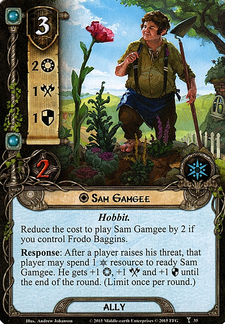
We go from a fairly decent departure of Hobbit-style to one that is very much in your face. Here we end on Sam Gamgee in his ally form. Andrew Johnson is responsible for this piece and in it we see a true,blue (no pun intended) Hobbit. Sam Gamgee’s face is as round as his stomach, and though you can tell he’s concentrated in his work there is still a jolly nature to everything as this rather large Hobbit looks upon a flower almost as tall as he. There are a lot of fun details in this illustration, from the many flowers, to the strength shown in Sam’s arms and legs, a nod to the character he will become. My favorite detail is the little flower wrapped around his suspenders. I’m a big fan of this piece and would probably name it my favorite depiction of Sam next to that of Alexander Dainche!
So there you have it! A bit of a dive into the little Hobbits and their portrayal in our (not so little) card game. As the pool grows we get to see more artists take their crack at what they see when they imagine these characters of Middle-Earth. Altogether I am very much satisfied with the game’s representation of Hobbits as a whole and look forward to what continues to come our way.
What are your thoughts? Do you enjoy the strong-jawed Hobbits or the one’s like Ally Sam Gamgee, or perhaps do you prefer ones by Romana Kendelic? Let me know in the comments below and feel free to chime in about the other folk of Middle Earth and how you feel about their representation!
Thanks for reading!
-The Secondhand Took
